Portfolio:
Joseph‘sDeli
A fresh and flavorful approach, serving friendly prices with daily specials, artisan sandwiches, house-made soups, & crisp salads. All fresh, the way nature intended.
The Summary
The client, a small mom-and-pop deli, reached out to Wolozo in need of a quality website to replace their dated Weebly site.
During the Discovery Process, we agreed that now was an excellent opportunity to take advantage of a rebuild of the brand identity to grow the customer base and raise brand perception.
Deliverables
Brand Strategy, Copywriting, Logo Design, Print Design, Tagline, Website Design, Website Development, Website Strategy
The Challenge
Branding
The foundation of a successful brand is an image, tone, and feeling that positions the company culture, services, and personality as a lasting perception in the mind of the target customer. A successful brand strategy begins with understanding the customer and the competition.
The previous branding did not represent the heart of our client in a way that spoke to the target customer. The color scheme was simple and did not catch the eye of the public or differentiate itself from the competition. The tone of voice was inconsistent and lacked many of the key attributes that made the personality of our client.
Website
The old website lacked consistency, structure, and had an outdated visual appeal that could leave a bad taste in the mouths of the potential customer.
The information of the previous restaurant website design was not presented structurally or fashionably and lacked a concept that accurately embraced the client’s restaurant branding. Features, like online ordering, weren’t available, which missed the customer’s needs and made it hard to grow in today’s modern restaurant economy.
Our client also had difficulty editing the content of their old website. They offer Daily Specials and required a quick and easy way to update the site with the special of the day.
Unique Aspects
The client requested a need to easily change the color scheme of the website to reflect special occasions visually.
The Solution
Logo
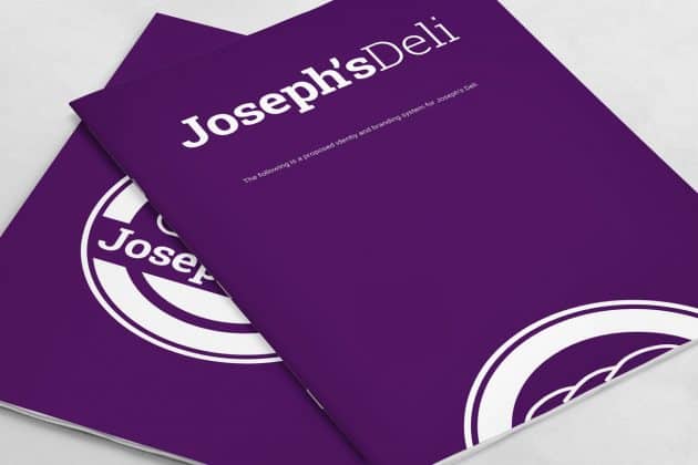
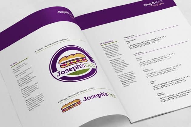
Phase One was to create a logomark that captured the personality and service of the client. The previous logo reasonably functioned at portraying the offerings of the client. However, it lacked the fun, family-style charisma that was the brand.
Color Palette
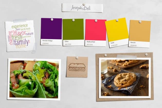
We knew we had to conform to typical colors that a sandwich would consist of, such as green lettuce and red tomatoes., We knew it might be challenging to differentiate the branding colors of competing delis and sandwich restaurants.
Tone & Tagline
During the Discovery Phase, we determined the ideal audience, along with the initial core values. We then analyzed the tone of the competition to limit collision and to ensure we emphasized the client’s personality and strengths.
Site-Header
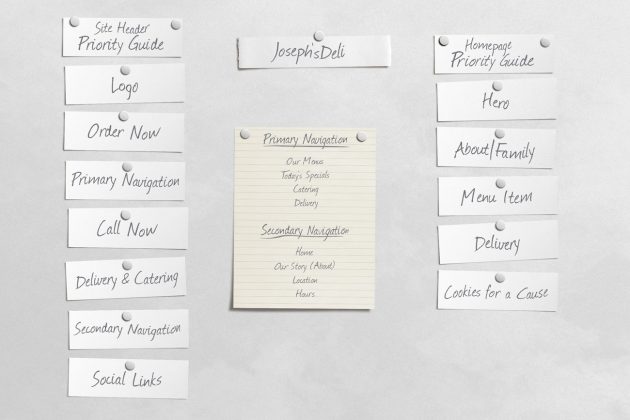
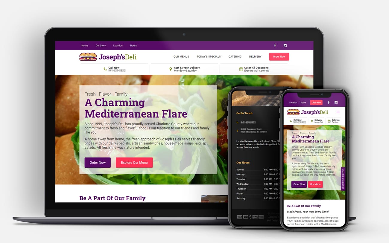
We understand that more information is not always more useful. So we ran a small survey to determine what information a user is after when visiting a local restaurant. The results included information such as phone number, hours of operation, location, social media links, etc.
Based on the results, we decided to satisfy the underlying needs of the site visitor and set out to create a solution to integrate as much of this information within the site-header. We knew achieving this would require some challenging design decisions to ensure we prevented any cognitive overload and that the user experience remained inline.
During our exploration, we came to the conclusion that the website needed to separate the site header’s navigation with a primary and secondary menu to allow better prioritization of the user needs.
Copywriting & Wireframes
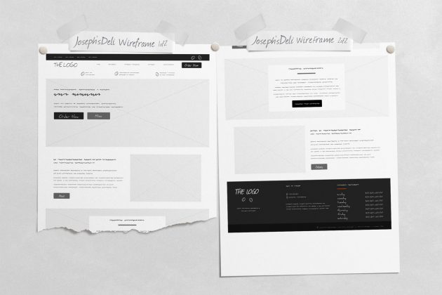
We then explored various design strategies during the formation of the information architecture of the various pages, including what methods we could utilize for the homepage’s persuasive design. We handled the majority of the copywriting and content gathering before producing the wireframes.
During the Development Phase, we implemented on-site SEO, Website Performance Optimization, and real Mobile Responsive Design.
