Portfolio:
SparrowRanch
Large themed, nonprofit events designed especially for special needs children and their families with music, storytelling, and sign language in a loving oasis environment.
The Summary
A collaboration project with a web security agency, Wolozo worked side by side, designing a solution to increase donations and creating a full website redesign based on the art direction of the nonprofit’s branding.

Deliverables
Website Design, Website Development, Website Strategy
The Challenge
Website
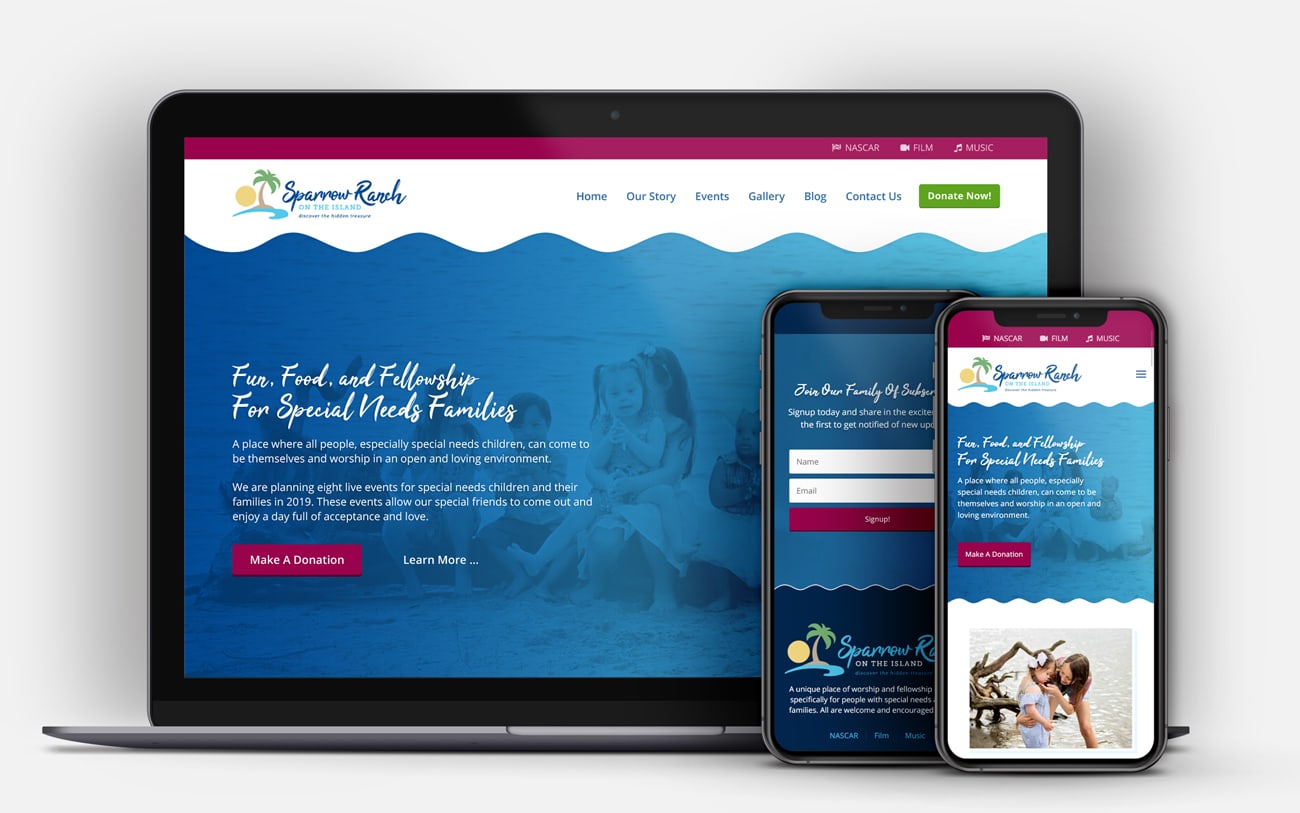
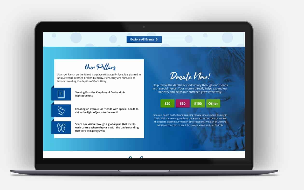
The old website did not reflect the brand identity, and the design of each page lacked overall structure and consistency. Also missing from the previous website were persuasive design techniques to attract visitors to contribute donations.
The content of the prior nonprofit website design was not presented structurally or with visual appeal. The design was without an approach that took advantage of the nonprofit’s branding.
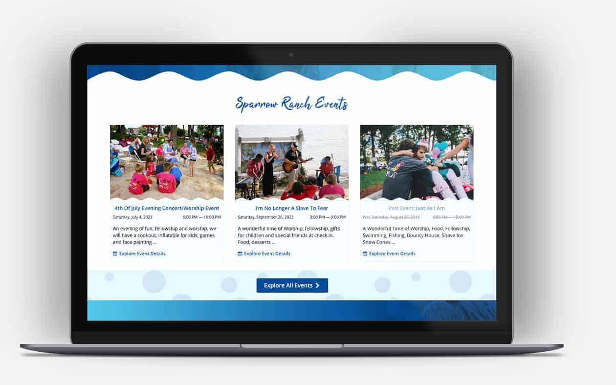
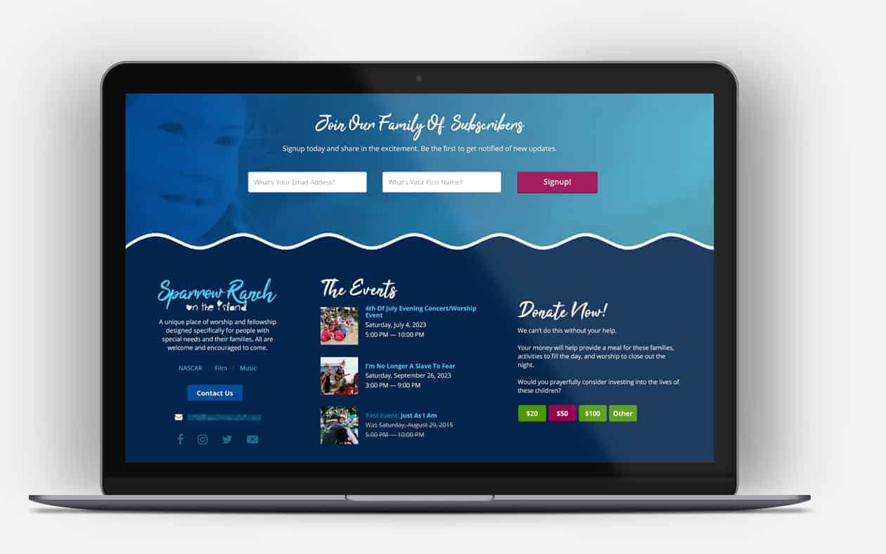
Required features, such as displaying events, weren’t dynamic, which left the nonprofit unable to add and display upcoming events easily.
A strong focus on website accessibility and inclusive wording were required.
Unique Aspects
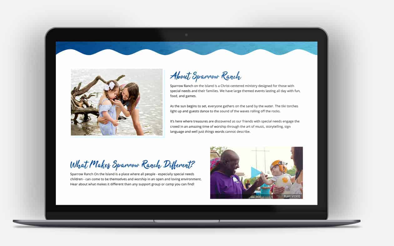
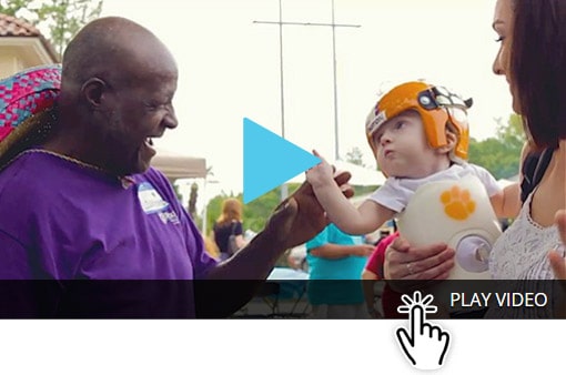
Wolozo identified that links and buttons with standard wordings such as “View More” and the triangular play button, are not inclusive of nonsighted and visually impaired users and required us to establish more inclusive words and design patterns.
The Solution
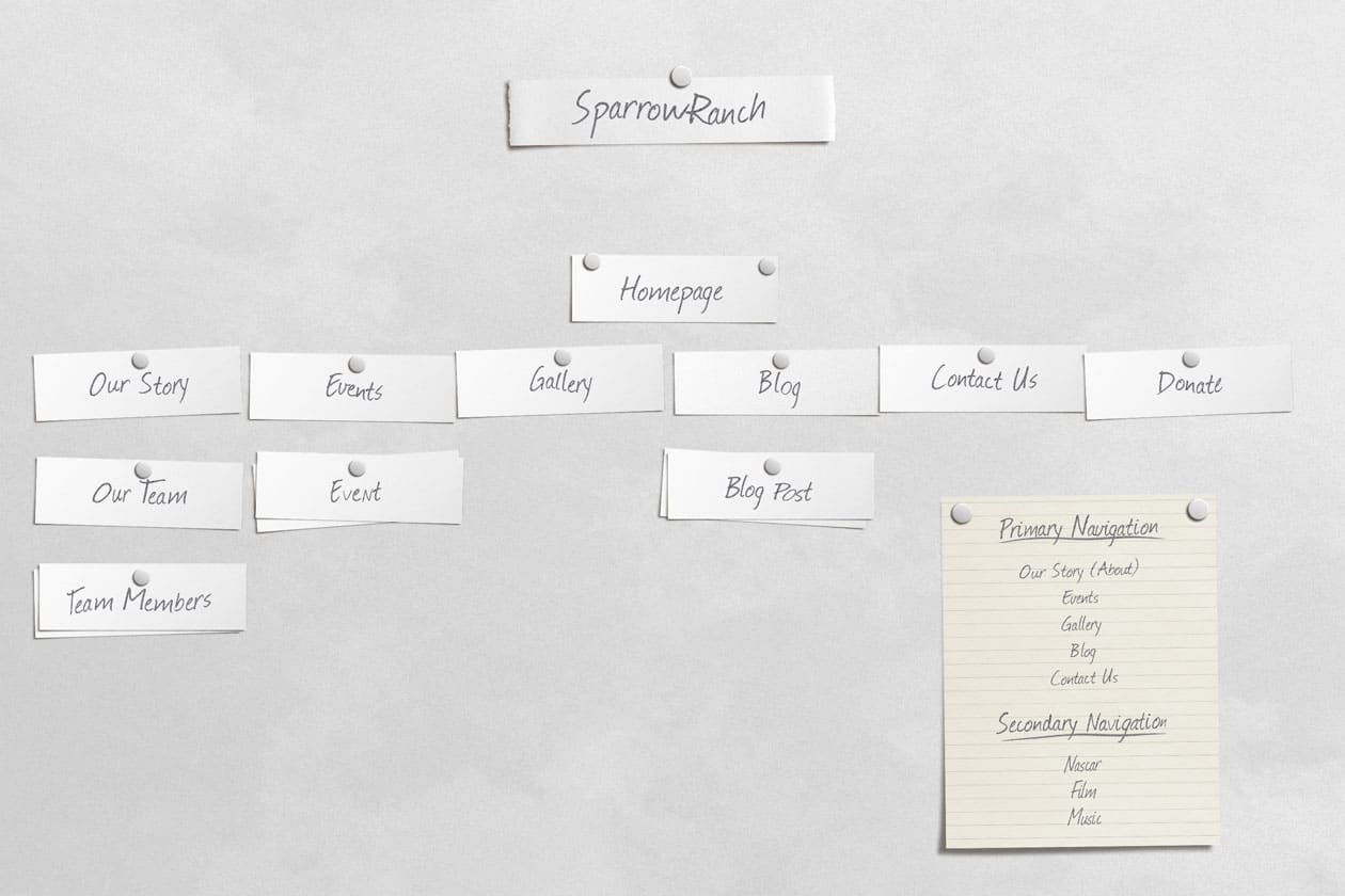
Information Architecture
We wanted to achieve a logical and straightforward user flow through the navigation and the site’s content. As a result, we sifted through numerous design strategies while planning the nonprofit’s information architecture.
We refrained from implementing dropdown menus within the navigation to prevent issues for users with reduced dexterity which may have difficulties accurately hovering the mouse cursor over a menu item to reveal a sub-menu.

Layout & Design
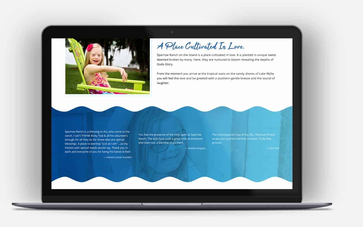
To provide an accessible color contrast for users with low vision, we created an additional color scheme that was also harmonious with the brand identity. We also took advantage of this by selecting the new colors to fit inline with visual persuasive web design.
The persuasive design and structured content deliver a charming visual appeal. Through collaborative efforts, the final layout achieves a consistent reflection of the brand identity and the provided art direction.
The nonprofit is now easily able to add upcoming events, and past events are automatically prefixed as past events.
The Result